Branding Inspiration · Apps
Instagram has never been just an app for sharing photographs. For many people, it is a place to find inspiration, build community, grow a business, and begin making something of their own. When a platform evolves from a simple product into a part of culture, its visual identity cannot remain in the same place.
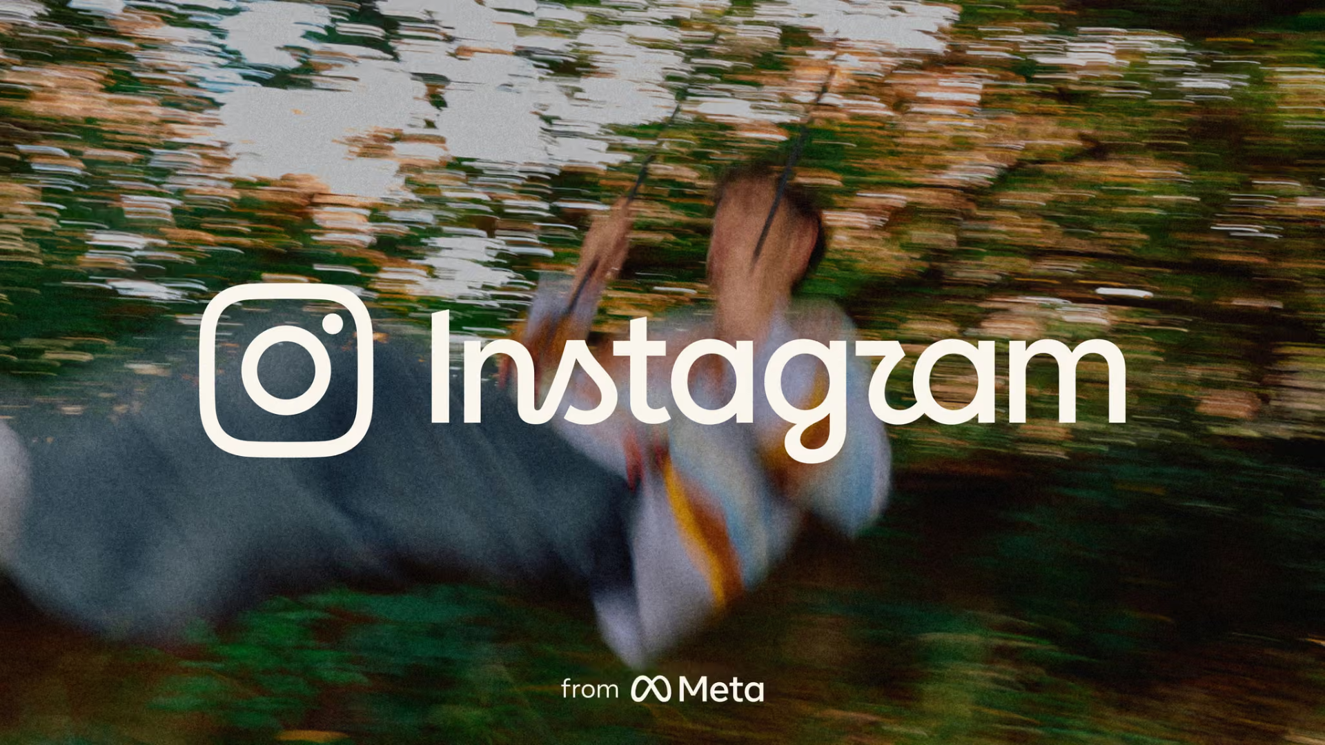
In 2026, Instagram introduced a new brand identity spanning its wordmark, typography, gradients, and user interface. This was not an attempt to turn Instagram into an entirely different brand. Instead, the refresh uses a more contemporary visual language to reflect what Instagram has become today: more distinctive, more flexible, and better prepared for what comes next.
Why did Instagram need a refresh?
Instagram’s last major brand design update took place more than a decade ago. Since then, its community has grown significantly larger and more diverse. The camera icon has become a globally recognisable symbol. The wordmark, however, has had to operate across an increasingly complex range of contexts.
It now appears not only inside the app, but also across global campaigns, creator programmes, cultural partnerships, and new products such as Edits.
The challenge, then, was not simply to make the logo feel more modern. Instagram needed a complete identity system capable of carrying the brand into its next chapter, while preserving the personality and familiarity it had built over the years.
Today, Instagram is a cultural platform shaped by creators, communities, businesses, and everyday interactions. Its new identity needed to reflect this expanding role while maintaining a clear connection to the brand’s heritage.
The design direction was guided by several priorities:
•Preserve recognisability by retaining the handwritten character, icon, and gradient that people already associate with Instagram.
•Expand visual expression so the brand can work more fluidly across formats, motion, languages, and cultural contexts.
•Put community creativity first by creating a visual system in which community content—not the brand itself—remains the protagonist.
A new wordmark that keeps the old memories
The design team did not abandon the handwritten quality that made the original wordmark so memorable. Instead, they refined it, making it more concise and more confident.
The result retains the warmth of a personal, hand-drawn gesture while introducing a cleaner rhythm that allows the wordmark to move smoothly across a much larger ecosystem. Koto’s design process explored hundreds of directions, from handwritten letterforms to calligraphic strokes and approaches that made the typography feel more human.
One of the most intriguing details is the redesigned “r.” It echoes the original handwritten form while giving the new wordmark a more distinctive, almost totemic character. In a small but meaningful way, it creates a connection between Instagram’s past and its future.
Making the gradient feel like light
The gradient remains one of Instagram’s most recognisable brand assets. In the new visual system, however, it takes on a more dimensional and dynamic role.
To create the sensation of light radiating from within, Meta collaborated with 3D digital artist and motion designer Rose Pilkington to develop an innovative 3D modelling process. This approach enabled Rose to create adaptable digital light sources that could respond to different applications and contexts.
“The concept is that the gradient feels like it’s made of light, so it feels illuminated. And it has a kind of a sense of depth to it,” says Rose.
As a result, the gradient can take on a unique visual expression each time it is used. Rather than functioning as a fixed colour combination, it behaves more like a living material—capable of shifting, glowing, and responding to its surroundings.
Evolution can be bold in its own way
Instagram’s new brand identity keeps the handwritten wordmark, icon, and gradient that people have come to know, while giving each element greater flexibility and a clearer expressive purpose.
The overall identity feels more open, more dimensional, and more prepared for the many ways creativity moves and unfolds around the world. It is a reminder that evolution does not always require a complete reinvention. Sometimes, the boldest move is to understand what people already recognise—and give it more room to grow.
For a brand as culturally embedded as Instagram, this balance is especially important. The refresh does not erase the past. It builds on it, creating a more responsive identity system for a platform whose most important stories continue to come from its community.
At Tomo Studio, we see this kind of evolution as a valuable lesson in brand design: a strong identity should be recognisable enough to feel familiar, yet flexible enough to keep making space for new ideas.
.png)