BARE

Things we did
Brand Identity Design
Packaging Design
Industry
A Natural & Sustainable Food Brand
Year
2024

We partnered with Hong Kong-based BARE to translate their commitment to "unshielded purity" into a premium brand story. Our mission was to create a visual identity that reflects their additive-free philosophy—proving that health and taste can coexist beautifully.

The Storytelling
Every great brand begins with a conversation. We conducted deep-dive branding interviews with the founders to uncover the "why" behind BARE—identifying their drive to provide the safest, most natural sugar alternatives for friends and family. This narrative became the foundation of our design strategy.
Defining the "BARE" Identity
The name BARE is a promise of honesty. We crafted a logo using clean, minimalist lines to reflect a brand that has nothing to hide. This sophisticated typeface conveys the "fundamental and important" nature of their ingredients while remaining approachable and friendly to the everyday cook.
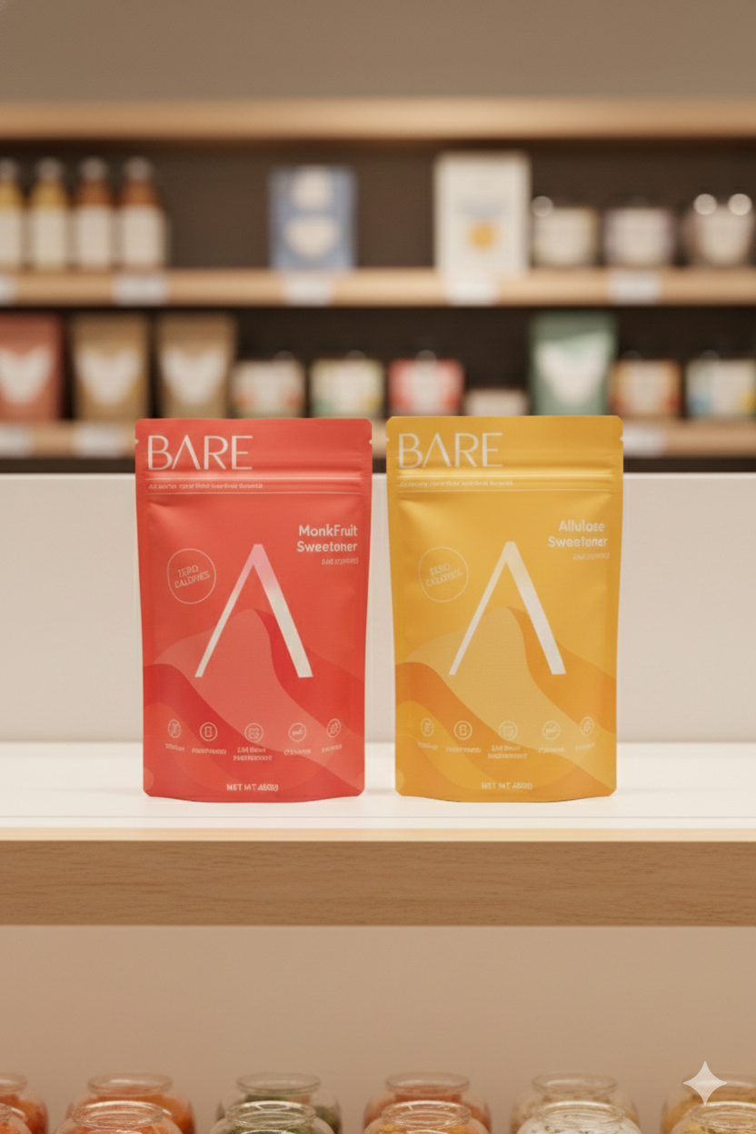
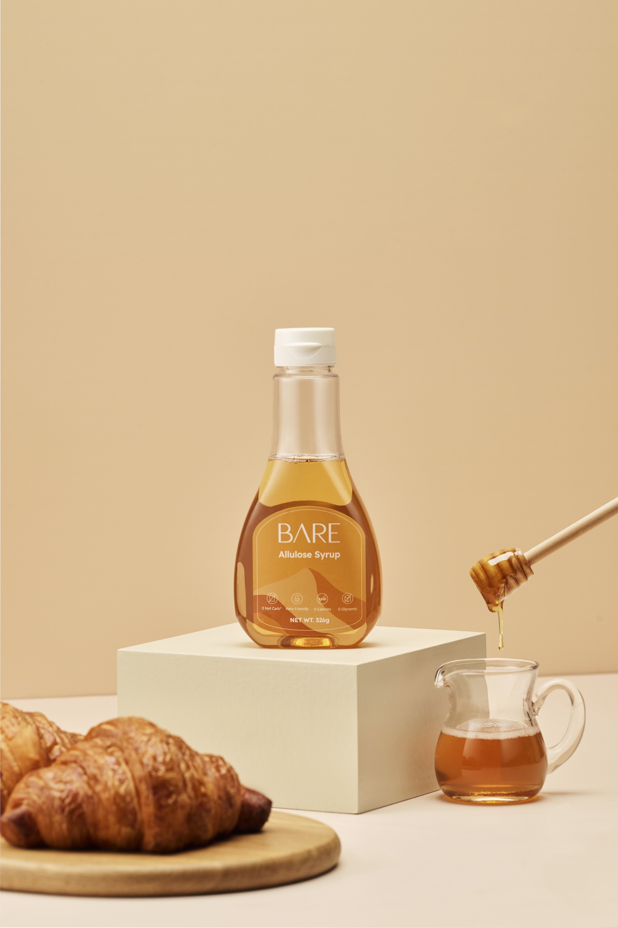
A Palette of Raw Ingredients
To visually represent the brand’s "no-additive" philosophy, we curated a palette of solid, earthy tones. These colors are inspired by raw, unprocessed food sources, reinforcing BARE’s commitment to providing high-quality, sustainable alternatives like monk fruit and allulose.
The "A" Motif & The Mountain Silhouette
We transformed the unique "A" from the BARE logo into a recurring signature across the packaging ecosystem. To enhance the "nature-soft" vibe, we layered the "A" against a subtle mountain-shaped backdrop. This landscape element symbolizes the raw, high-altitude origins of ingredients like monk fruit, creating a cohesive and high-end look that feels both trustworthy and grounded in the natural world.
Balancing Health with Happiness
The final design system bridges the gap between functional health and the joy of eating. By focusing on a "clean-label" aesthetic, we ensured that BARE effectively communicates its values: that the most basic ingredients are often the most important ones for our future well-being.
By distilling BARE to its most authentic form, we built a resilient brand story rooted in transparency. At Tomo Studio, we believe clear strategy creates more than just a product; it builds a lasting bond with the community.
More 

work