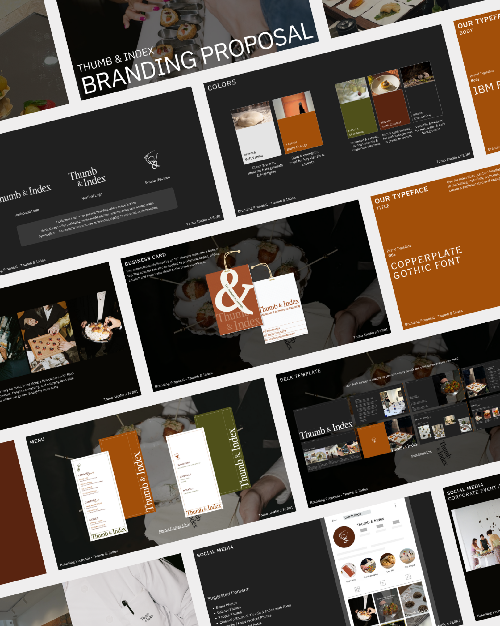
A palette inspired by the feeling of art
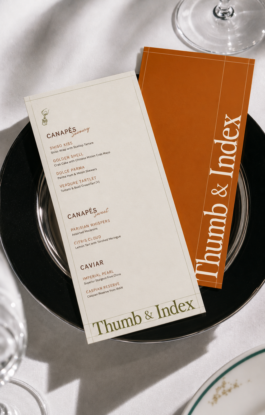
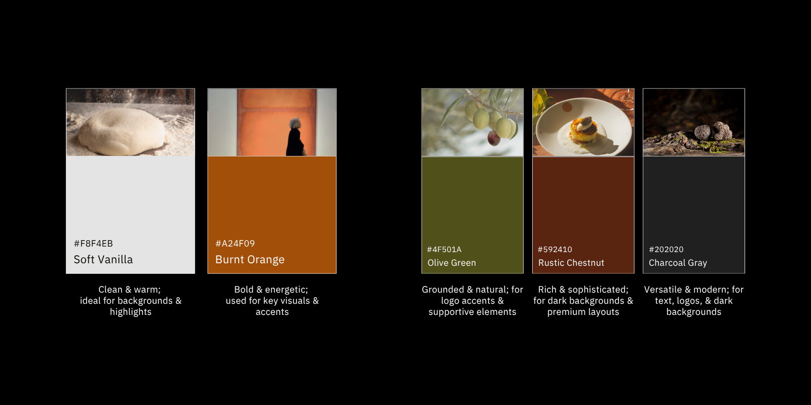
Inspired by the colours of a painter’s canvas, the palette is designed to linger in the mind like an artwork remembered long after a gallery visit. Soft Vanilla and Burnt Orange form the expressive core, while Golden Olive, Rustic Chestnut, and Charcoal Gray add depth and balance. Across the identity, from the minimal menu to the connected name-card concept, these details create a world that feels sophisticated, tactile, and made to be experienced.
.gif)